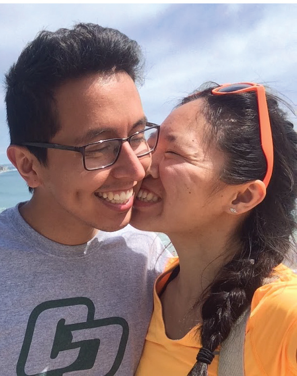
Cheek to Cheek
I created this couple's portrait for my girlfriend as a Christmas present. My objective for this project was to make a semi-realistic illustration based on photograph. In Adobe Illustrator, I began by making a contour drawing of ourselves using the pen tool. At first, I made simple outlines by jotting down anchor points. These points were then converted from corners to smooth. Afterward, I adjusted the path curves using handles. I'm aware that certain artists begin by making curved anchor points but I find my approach just as efficient in terms of time. When two or more objects overlapped, I used the shape builder tool to trim away the excess paths. This process was then repeated over and over again. To maintain an organized layout, I grouped distinct features in layers and sub-layers. Once I completed the contour drawing, I duplicated the layers to fill in the paths. The mesh tool was not used at all throughout the illustration; I just used a series of overlapping fills for color. These fills included a variety of gradients and transparencies. One of the most challenging aspects was getting too zoned into the details. Every so often, I would take a break to examine the big picture to make sure I was on the right track. I'm satisfied with how the final illustration came together. In regards to printing, the great thing about vector graphics is not being restrained by resolution. Although it was tempting to print a huge poster of the portrait, I kept it modest to 7.5" x 9.5", perfect to hang up on a wall.


