Project Scope
For my senior project while attending California Polytechnic State University, I created brand assets and marketing collateral for the the Dream Center. This project merged my love for design and passion to help empower disadvantaged students fight through adversity. My personal objective was to apply my artistic abilities and technical skills towards spreading awareness of Cal Poly’s Dream Center.
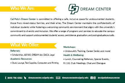
Cal Poly’s Dream Center is committed to offering a safe, inclusive space for undocumented students, those from mixed-status families, and their allies. The Dream Center maintains the confidentiality of individual students while fostering a welcoming community environment that aligns with the university’s commitment to diversity and inclusion. The Dream Center offers a range of programs and services to educate the campus community and support undocumented students’ access, persistence, graduation, and post-graduate pursuits.
Dream Center Icon
Under the supervision of the Dream Center Coordinator, Katherine Zevallos Pastor, and the Director of Marketing and Communications for Student Affairs, Yukie Murphy, my first assignment at Cal Poly’s Dream Center was to finalize their icon which was in the process of review at the time.
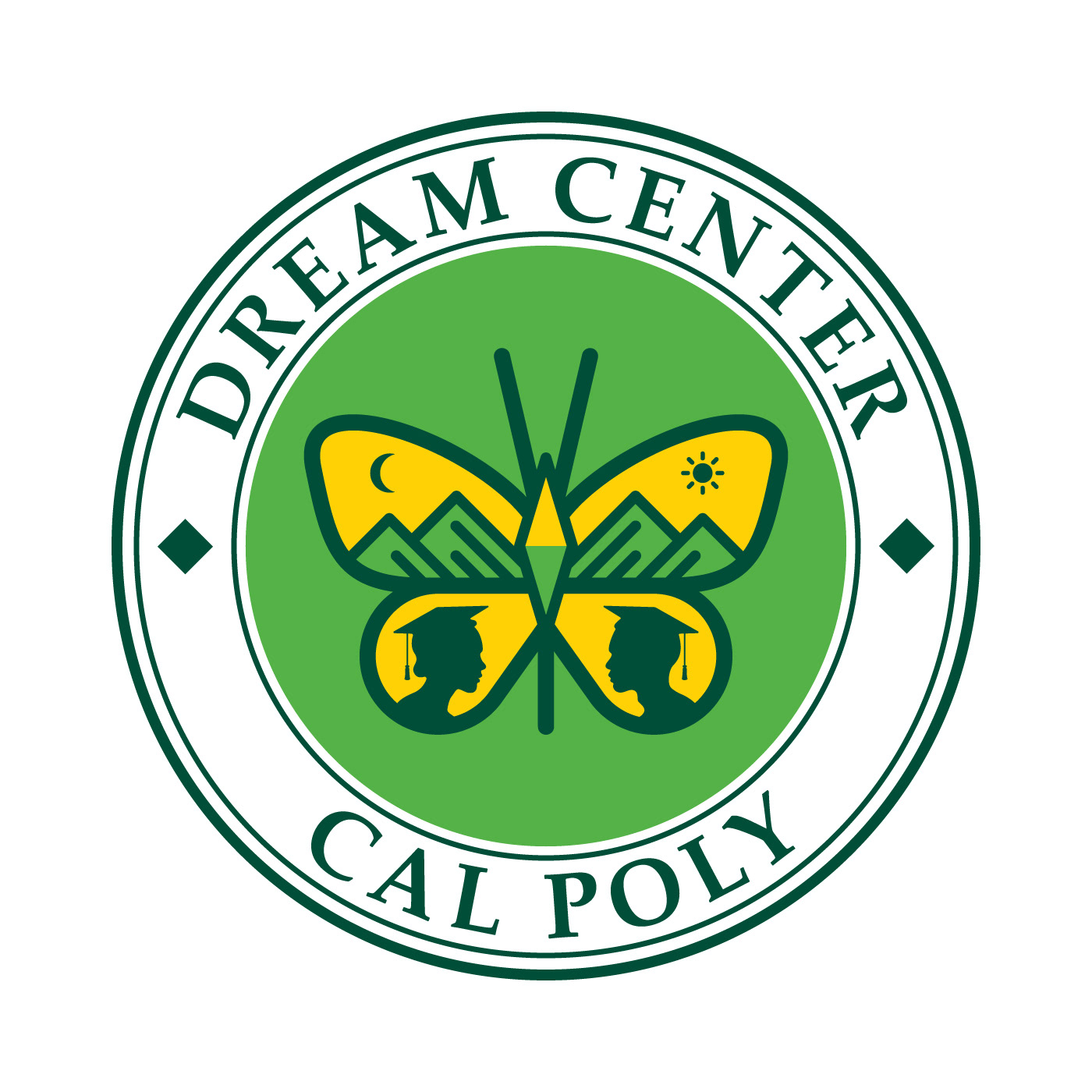
The original icon incorporated specific design elements that Dream Center members could associate with. The butterfly symbol has been adopted by many immigrant friendly organizations and communities. It represents monarch butterflies, which are a migratory species that journey between Mexico and the United States. The icon also included mountains that reflect those of San Luis Obispo but also symbolize the barriers immigrants overcome. My contribution was adding silhouettes of two graduates and a compass as the butterfly’s body to symbolize guidance.
Rebrand
The challenging part of rebranding the Dream Center icon was not straying too far from the original idea while also adding something new. Additionally, the files I was given were created in a way that lacked organization and structure in terms of layering. To overcome these challenges, I started scratch by recreating the butterfly design using the Pen Tool in Adobe Illustrator. I’m somewhat of a perfectionist so I meticulously ensured all the elements were symmetrically aligned using grids, guides, and organized layers.



Structure
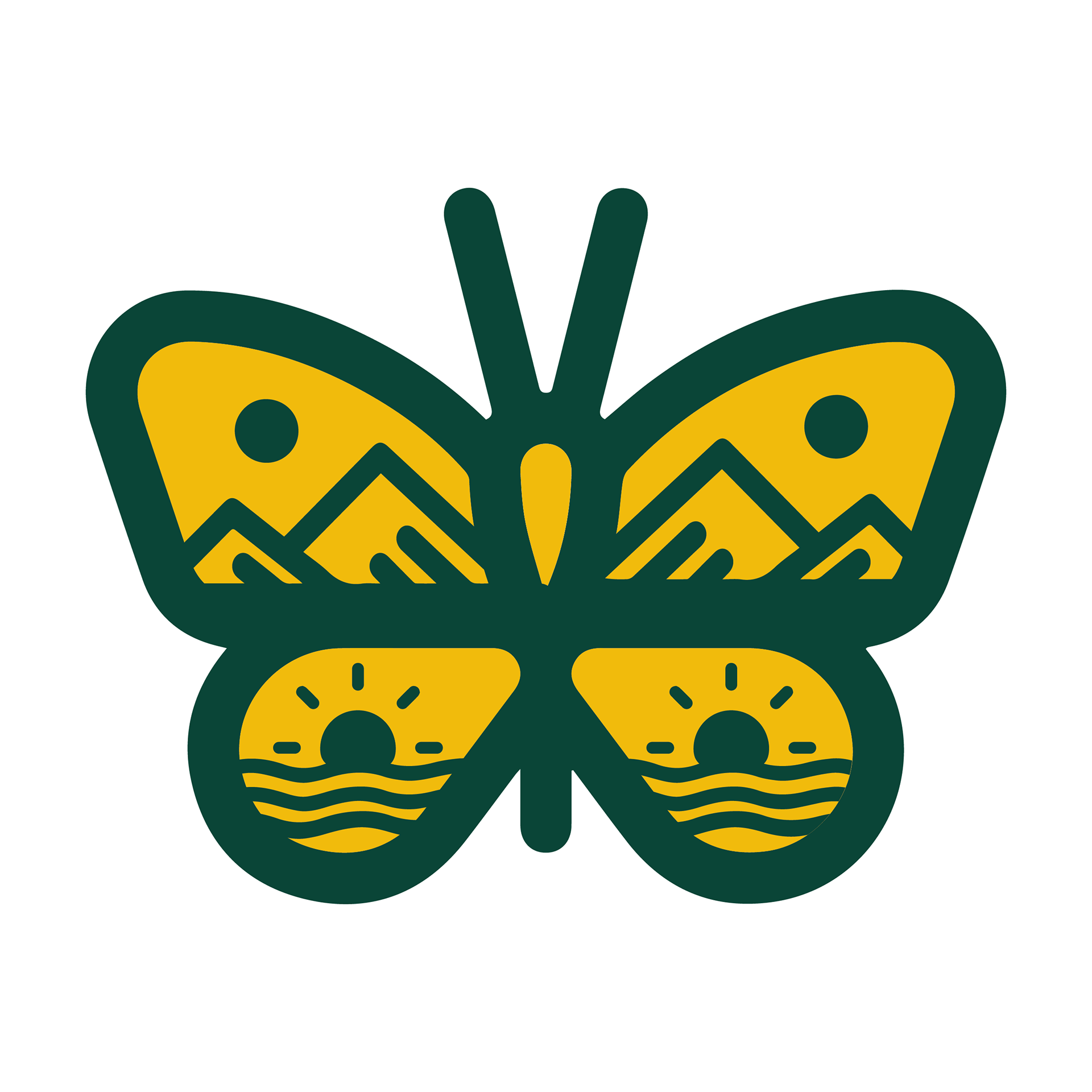
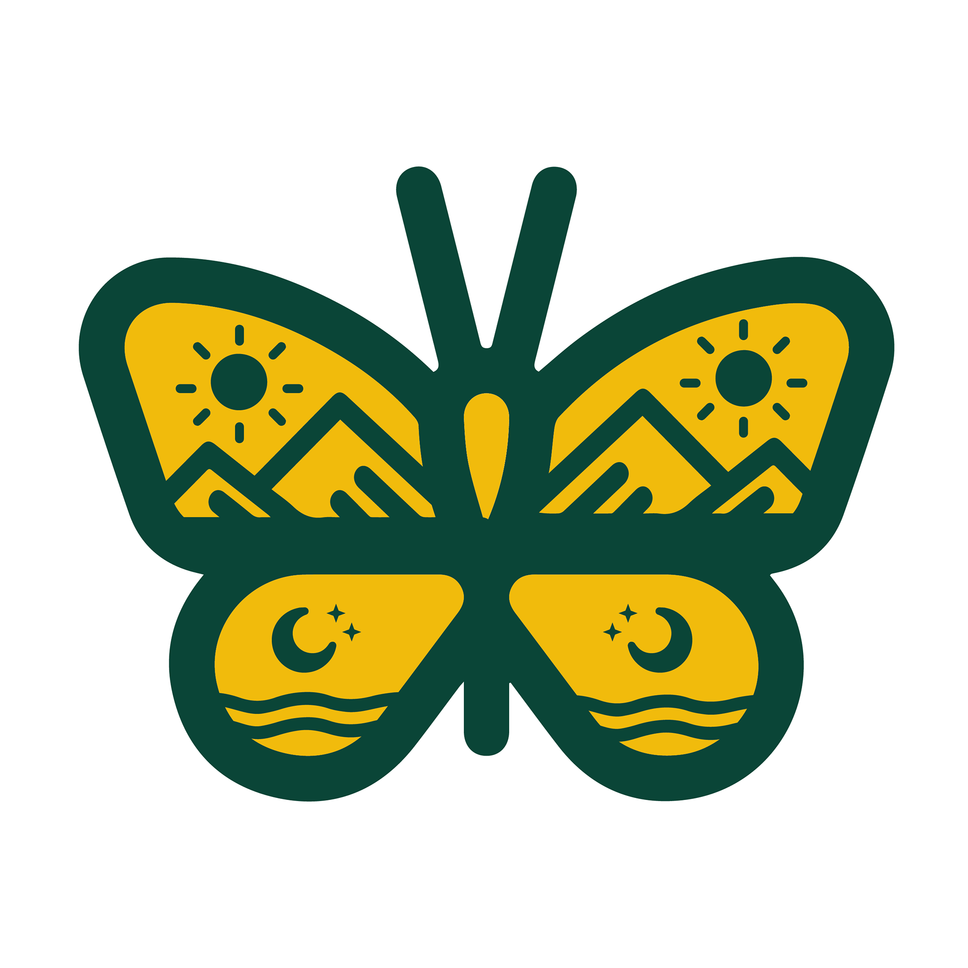
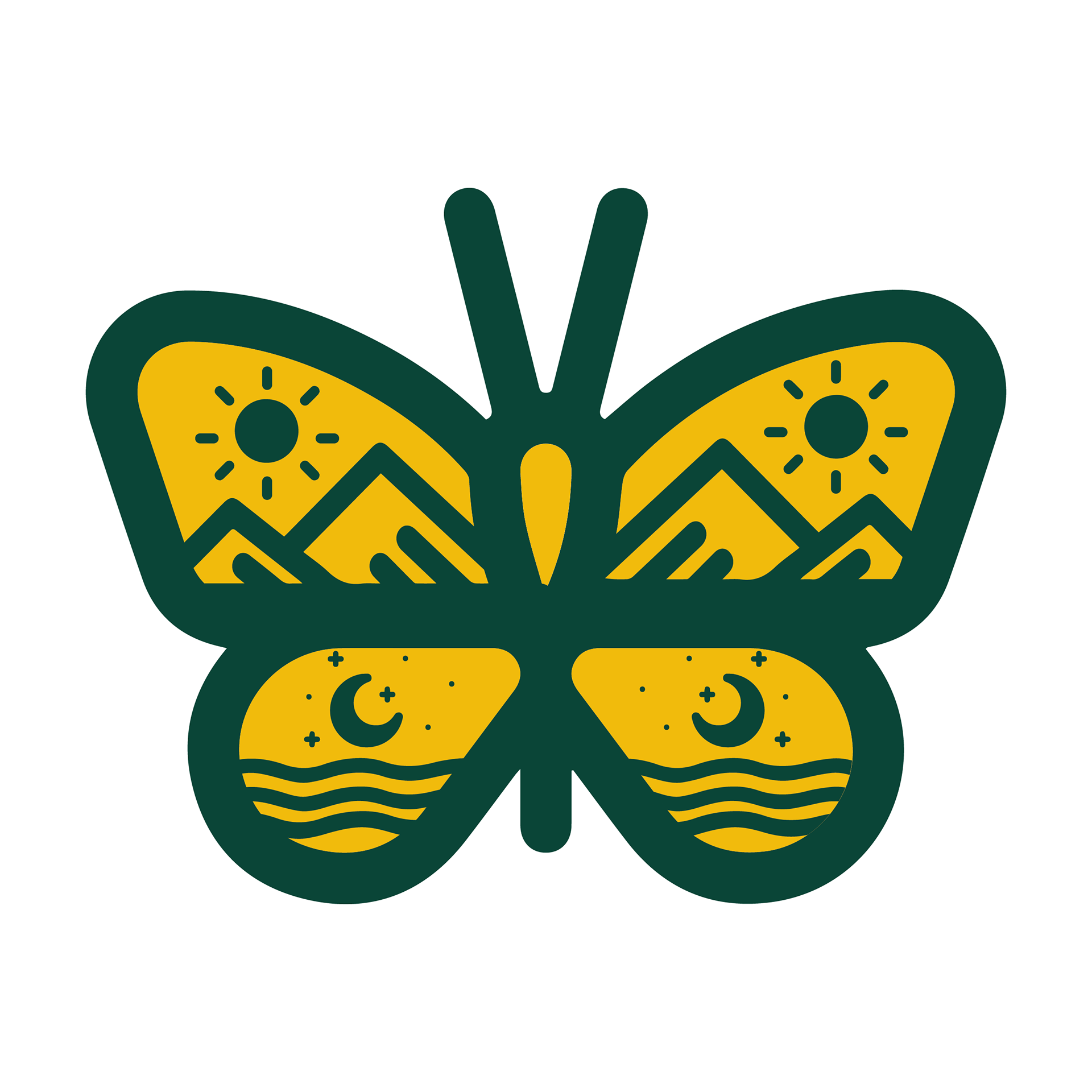
Above is the final logo converted to outlines with cyan guides that showcase how each component was aligned in relation to the overall composition. Once everything was in its place, I could then adjust the stroke weight to a desirable width.
Typeface
I used Cal Poly's official typeface, Palatino, to abide by branding guidelines. The font weight was increased to bold for better legibility.
Colors
Rather than using Cal Poly's primary colors, I thought it was more appropriate to incorporate the bright secondary colors to convey a sense of vibrancy. The color combination also has the right amount of contrast for legibility from a variety.
Logo Versions
After I completed the master logo, I created additional versions suitable for various backgrounds and contexts.


Marketing Material
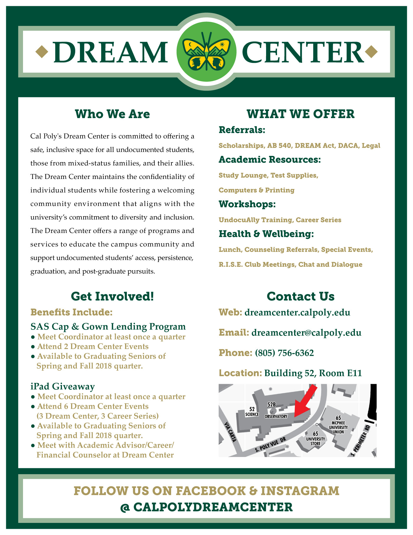
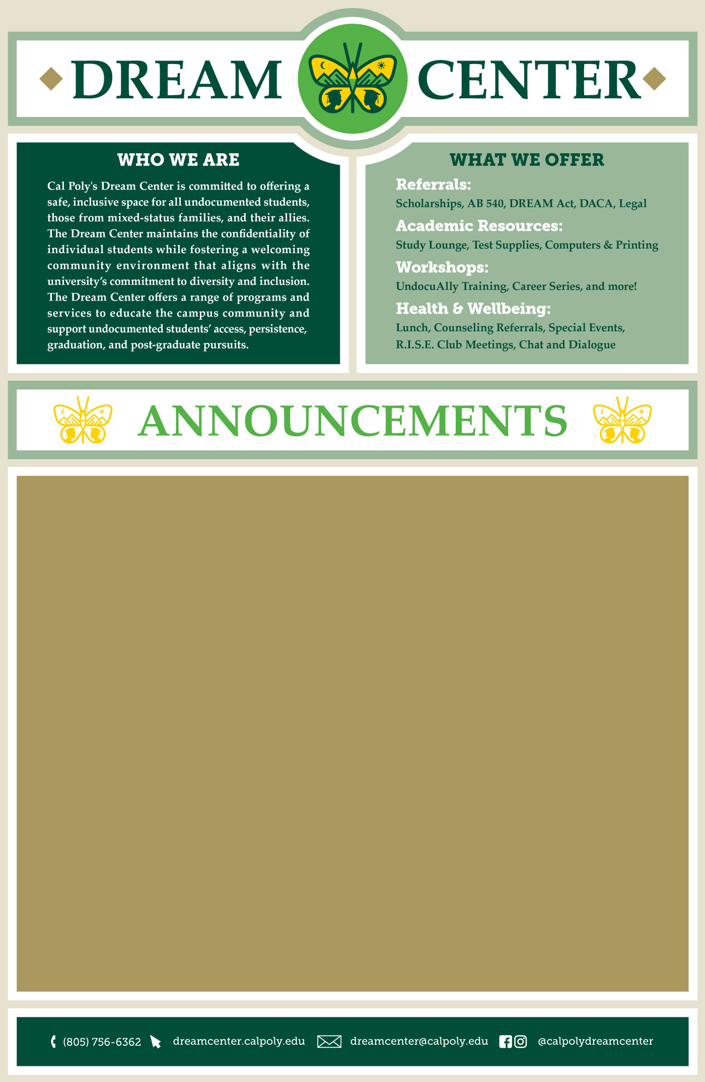
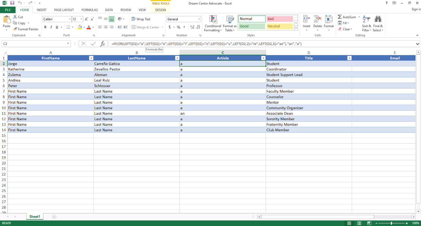
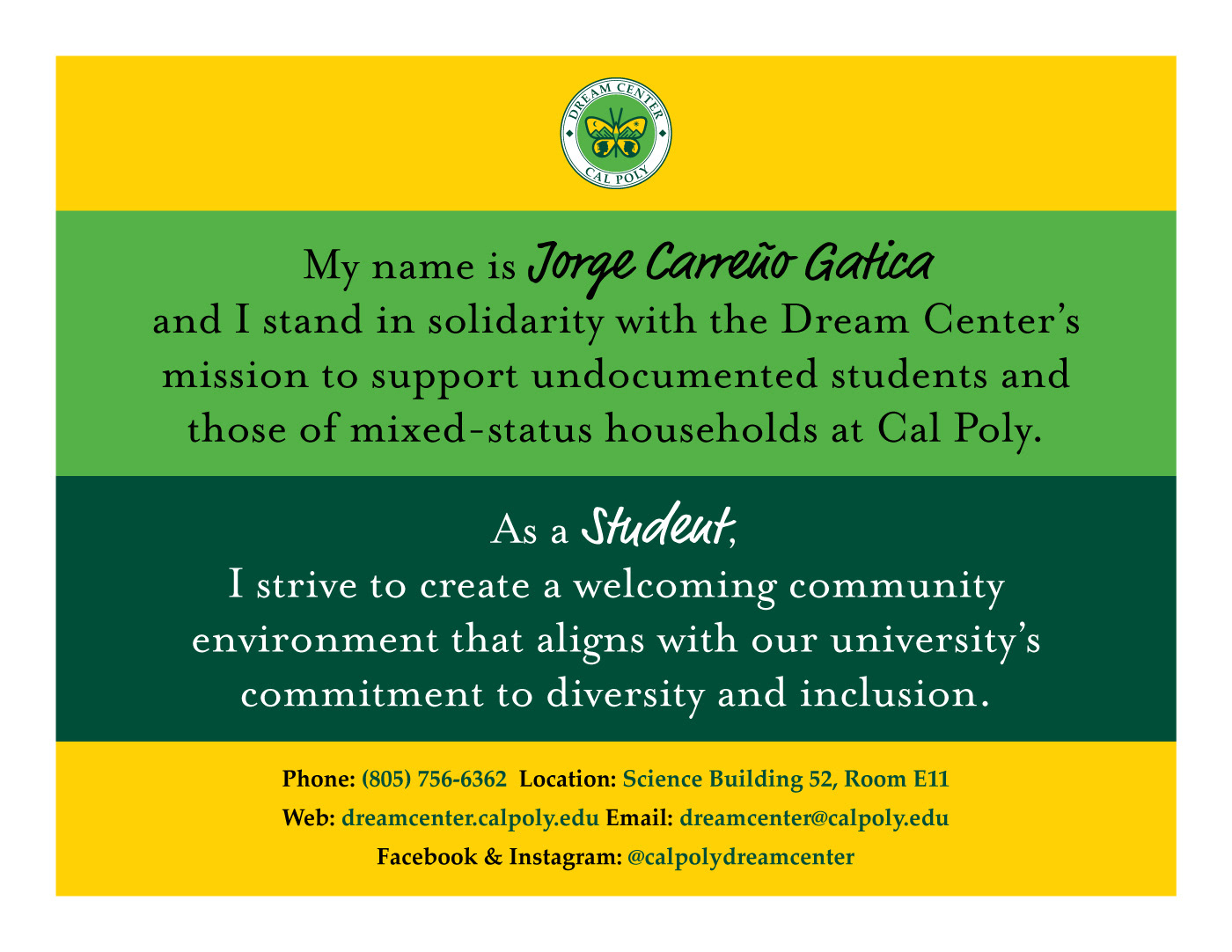
Upon approval of the Dream Center branding assets, I applied them into marketing material. Viewed from left to right, the items are as follows: single sheet flyer, bulletin board graphic, promotional sell sheet, and advocate display. I was inspired to create the advocate display by Untied We Dream's "Unafraid Educator" poster. I incorporated variable data in the text fields by using Adobe InDesign's data merge feature in junction with a Microsoft Excel spreadsheet. A fun challenge I overcame was creating a function to match the right article according to the title.
